 Portions of the materials are the copyrights and trademarks of White Wolf Publishing AB, and are used with permission. All rights reserved. For more information please visit
 Crypt card redesign
Ke. wrote: The empty white space looks tragic on the cards without much text — they almost look unfinished, like someone doesn't care.
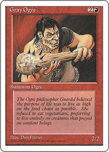
Bystander talking: Magic the gathering generally deals with this problem by having a fixed size text box, but if it would be too empty, some flavor text is added.
Flavor text is a quote or original piece of text loosely connected to the card in question. It has no rules significance and just basically serves as filler. Flavor text is usually written in italics to mark it different from actual rules text.
Here's an example that has no special abilities:
Example of combined rules text and flavor text
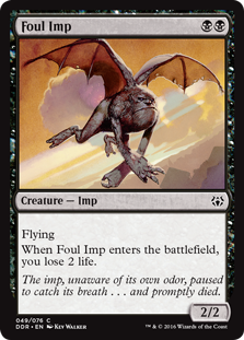
"Plenty of little men tried to put their swords through my heart. And there's plenty of little skeletons buried in the woods."
- Tormund Giantsbane, Game of Thrones
Please Log in or Create an account to join the conversation.
- Bloodartist
-

- Offline
- Antediluvian
-

- Posts: 671
- Thank you received: 103
The conversation did not became very productive.
If we are going to discuss about it again, I had a new idea : what if flavor text were add in "grey box" like draft effect on the current cards ?
It could still fulfill its purpose and no one would mistake it for a game-effect.
Please Log in or Create an account to join the conversation.
666Raziel wrote: Well, earlier on this topic, few of us suggested that we add flavor text on crypt cards.
The conversation did not became very productive.
If we are going to discuss about it again, I had a new idea : what if flavor text were add in "grey box" like draft effect on the current cards ?
It could still fulfill its purpose and no one would mistake it for a game-effect.
when i look at that grey box describing draft effects I feel like i'm a puppy being kicked repeatedly in the urethra. please no.

Please Log in or Create an account to join the conversation.
- self biased
-

- Offline
- Antediluvian
-
- I pray at an altar of farts.
- Posts: 715
- Thank you received: 267

this new layout feels much like a 'roided out version of the original layout; a modernized gothic.
edit: i'll do a few more as I don't yet have access to the revised Library textures.
Please Log in or Create an account to join the conversation.
- self biased
-
- Offline
- Antediluvian
-
- I pray at an altar of farts.
- Posts: 715
- Thank you received: 267
I think it will be better even if Disciplines cover some of the artwork.
Please Log in or Create an account to join the conversation.


the Gangrel antitribu can really go either way in terms of a 'contrast' or 'highlight' outline of the portrait.
666Raziel: sure, but that will result in more frequent overhang of the Vampire Name on the portrait. one of the things that really frustrated me when i was doing the Full Bleed stuff almost two years ago was that there was a padding that was needed at the top of the portraits that I couldn't always get.
Please Log in or Create an account to join the conversation.
- self biased
-
- Offline
- Antediluvian
-
- I pray at an altar of farts.
- Posts: 715
- Thank you received: 267
- You are here:
-
Home

-
Forum
-
V:TES Discussion
-
Generic V:TES Discussion
- Crypt card redesign